The power of the written word in art is not to be overlooked. Uplifting, contemplative and thoughtful, typography art is a powerful method of communication, bridging the gap between artist and audience. Whilst brought together by the power of typography, all artists utilise the power of words in different ways. From Emin’s emotionally vulnerable writing to Shrigley and Ganjei's nonsensical musings, Blake’s nostalgic fonts and Holzer’s powerful statements, this group of artists illustrate the power and versatility of typography art.
Art and words have long been intertwined. From Medieval manuscripts to Egyptian hieroglyphics and beyond, typography art has long been used to connect to an audience and stimulate conversation. Contemporary artists now embrace the versatility of typography, using it to build bridges between communicator and viewer. Typography art is vulnerable, spirited and thought-provoking all at once, and the artists below illustrate this amalgamation of emotions beautifully.
Tracey Emin is the contemporary art scene’s poster girl for autobiographical and confessionary artwork. Rising to fame as a member of the YBA group, Emin creates artwork that is emotionally raw and confrontingly honest. She straddles the line between intimacy and universality, claiming that “the most beautiful thing is honesty, even if it’s really painful to look at”. Emin’s typography artworks pack an emotional punch, and we love how she uses her platform to draw attention to the power of the female voice. Emin works in a variety of mediums - drawing, painting, neon text and sewn appliqué - yet the power of her words shines through in all of them. Explore our collection of Tracey Emin artworks here.

Babak Ganjei is the master of the witty typography print. Babak’s humorous inner-musings are an enthusiastic mix of eccentricity and relatability - and this is all down to the familiarity of his hand-written artworks. For Babak, the brush is his equivalent to a pen, and the paper is his diary and his witty inner musings are weird and wonderful. Inspired by the music and comedy of the 1990s, Babak is a prolific artist whose artwork is energetic, unpredictable and darkly funny. Although a slightly absurdist take on the art of typography, Babak takes the art form back to basics, appealing to all audiences. Take a look at his collection here.

Fail by Babak Ganjei
Jenny Holzer’s art is a pure love letter to the written word. The American artist’s typography pieces are centred around the power of words, slogans and aphorisms that we can all relate to. Holzer’s fascination with language started in New York in 1977 where she began to write provocative phrases and sentences onto dollar bills, anonymously pasting them onto buildings around the city. This developed into her major project 'Truisms' - a series of over 300 items plastered with hard-hitting statements. Holzer’s poetic typography artworks encourage human interaction and individual interpretation, appealing to the truth-seekers in all of us. Explore Holzer's collection of typography artworks here.

Words Tend To Be Inadequate by Jenny Holzer
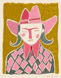
As the Godfather of British Pop Art, Sir Peter Blake is renowned for his boundary-pushing artworks. Perhaps best known for his collage artworks and his collaborations with music and film icons, Blake also has an affinity for the written word. The artist has long fostered a fascination with the alphabet, often utilising letters in his artworks. Blake takes typography back to basics, letting the fonts do the talking. As a young artist, Blake “allied himself with decorators, sign painters and commercial artists” and was inspired by their use of typography. This influence helped Blake develop his own typography style; his art typography in its purest form. Discover his collection of artworks here.

David Shrigley
Catapulting the eccentric British wit to the international stage, David Shrigley’s humorous typography artworks are universally relatable. Using his acerbic wit, Shrigley creates written artworks that are addictively funny. Reminiscent of childhood doodles in school book margins and diaries, these typography pieces are peculiarly familiar. We’ve all have our inner musings, yet Shrigley makes his public, embracing the absurdity of it all. Shrigley makes typography art accessible to a wider audience, meaning that people from all walks of life can find joy in his artworks. Taking witty typography to new heights, David Shrigley breaks down barriers between high and low art. Discover his collection of artworks here.

I Will Retrieve Your Phone (2021) by David Shrigley
It's not often an artist combines typography with classical portraits, but AAWatson seems to have mastered the art. Using found imagery from classical portraits, AAWatson combines this with his quintessentially British phrases like ‘Gibberish’ and ‘codswallop’ to create cheeky artworks that are eccentric yet relatable. AAWatson uses language to evoke joy; his art is a true testament to the power of words. Discover AAWatson's typography art here.

MUPPET (RED) by AAWatson
Are you as obsessed with typography art as we are? Discover our wide range of language-based limited edition prints here.